Jon Wang
2023.02.17
Jon Wang
2023.02.17


Xorbits 是探索和分析大型数据集的理想工具。本文将用数据领域经典的数据集,纽约出租车数据,来展示 Xorbits 的能力。该数据集记录了 2009 年至 2022 年纽约出租车行程记录。在本文中,我们将展示如何使用 Xorbits 对纽约出租车数据进行一些初始的探索,帮助您了解 Xorbits 的易用性与强大性能。
点击下面的链接可以打开 Google Colab 或 Kaggle 并直接运行本案例:
| 平台 |
|---|
| Google Colab |
| Kaggle |
更多的例子请访问 Xorbits Examples.
软件版本
- Xorbits>=0.1.2
- plotly==5.11.0
# 安装依赖
%pip install xorbits>=0.1.2 plotly==5.11.0 pyarrow
数据集
下载纽约出租车区域信息(区域划分与相关地理信息):
%%bash
wget https://d37ci6vzurychx.cloudfront.net/misc/taxi+_zone_lookup.csv
wget https://data.cityofnewyork.us/api/geospatial/d3c5-ddgc\?method\=export\&format\=GeoJSON -O taxi_zones.geojson
下载 2021 年纽约出租车行驶记录:
%%bash
for i in {1..12}
do
    wget https://d37ci6vzurychx.cloudfront.net/trip-data/yellow_tripdata_2021-$(printf "%02d" $i).parquet
done
%%bash
mkdir yellow_tripdata_2021
mv yellow_tripdata_2021-*.parquet yellow_tripdata_2021
初始化
首先,初始化 Xorbits:
import xorbits

# Initialize Xorbits in the local environment.
xorbits.init()
数据加载
第二步是将数据加载到 Xorbits DataFrame 中。我们可以使用 read_parquet() 函数来完成,该函数允许我们指定
Parquet 文件的位置和在读取数据时要使用的其他选项,如密钥等。
以纽约出租车数据集为例,以下是使用 Xorbits 进行数据加载的示例代码:
import datetime
import xorbits.pandas as pd

trips = pd.read_parquet(
    'yellow_tripdata_2021',
    columns=[
        'tpep_pickup_datetime',
        'tpep_dropoff_datetime',
        'trip_distance',
        'PULocationID',
        'DOLocationID',
    ])
# Remove outliers.
trips = trips[(trips['tpep_pickup_datetime'] >= datetime.datetime(2021, 1, 1)) & (trips['tpep_pickup_datetime'] <= datetime.datetime(2021, 12, 31))]
trips
| tpep_pickup_datetime | tpep_dropoff_datetime | trip_distance | PULocationID | DOLocationID | |
|---|---|---|---|---|---|
| 0 | 2021-01-01 00:30:10 | 2021-01-01 00:36:12 | 2.10 | 142 | 43 |
| 1 | 2021-01-01 00:51:20 | 2021-01-01 00:52:19 | 0.20 | 238 | 151 |
| 2 | 2021-01-01 00:43:30 | 2021-01-01 01:11:06 | 14.70 | 132 | 165 |
| 3 | 2021-01-01 00:15:48 | 2021-01-01 00:31:01 | 10.60 | 138 | 132 |
| 4 | 2021-01-01 00:31:49 | 2021-01-01 00:48:21 | 4.94 | 68 | 33 |
| ... | ... | ... | ... | ... | ... |
| 3212643 | 2021-12-30 23:04:37 | 2021-12-30 23:22:59 | 7.01 | 42 | 70 |
| 3212644 | 2021-12-30 23:31:58 | 2021-12-30 23:37:58 | 1.30 | 164 | 90 |
| 3212645 | 2021-12-30 23:53:54 | 2021-12-31 00:03:17 | 2.30 | 263 | 151 |
| 3212646 | 2021-12-30 23:28:00 | 2021-12-30 23:43:00 | 4.46 | 246 | 87 |
| 3212672 | 2021-12-31 00:00:00 | 2021-12-31 00:08:00 | 1.02 | 163 | 229 |
30833535 rows × 5 columns
taxi_zones = pd.read_csv('taxi+_zone_lookup.csv', usecols=['LocationID', 'Zone'])
taxi_zones.set_index(['LocationID'], inplace=True)
taxi_zones
| Zone | |
|---|---|
| LocationID | |
| 1 | Newark Airport |
| 2 | Jamaica Bay |
| 3 | Allerton/Pelham Gardens |
| 4 | Alphabet City |
| 5 | Arden Heights |
| ... | ... |
| 261 | World Trade Center |
| 262 | Yorkville East |
| 263 | Yorkville West |
| 264 | NV |
| 265 | NaN |
265 rows × 1 columns
import json
with open('taxi_zones.geojson') as fd:
    geojson = json.load(fd)
一我们将数据加载到 DataFrame 后,可能希望通过查看行数和列数、每列的数据类型以及数据的前几行来了解数据的整体结构。
我们可以分别使用 shape、dtypes 和 head() 来实现:
trips.shape
(30833535, 5)
trips.dtypes
tpep_pickup_datetime     datetime64[ns]
tpep_dropoff_datetime    datetime64[ns]
trip_distance                   float64
PULocationID                      int64
DOLocationID                      int64
dtype: object
trips.head()
| tpep_pickup_datetime | tpep_dropoff_datetime | trip_distance | PULocationID | DOLocationID | |
|---|---|---|---|---|---|
| 0 | 2021-01-01 00:30:10 | 2021-01-01 00:36:12 | 2.10 | 142 | 43 |
| 1 | 2021-01-01 00:51:20 | 2021-01-01 00:52:19 | 0.20 | 238 | 151 |
| 2 | 2021-01-01 00:43:30 | 2021-01-01 01:11:06 | 14.70 | 132 | 165 |
| 3 | 2021-01-01 00:15:48 | 2021-01-01 00:31:01 | 10.60 | 138 | 132 |
| 4 | 2021-01-01 00:31:49 | 2021-01-01 00:48:21 | 4.94 | 68 | 33 |
时序分析
分析纽约出租车数据集的一个角度是查看乘车数量如何随时间变化。一个特别有趣的分析是找出每个工作日每小时的乘车数量。 我们可以在 DataFrame 中创建两个额外的列,分别表示行程开始的星期和小时。然后,我们可以使用 groupby 方法按照星期几和小时分组数据,并计算每组的旅途数量。
trips['PU_dayofweek'] = trips['tpep_pickup_datetime'].dt.dayofweek
trips['PU_hour'] = trips['tpep_pickup_datetime'].dt.hour
gb_time = trips.groupby(by=['PU_dayofweek', 'PU_hour'], as_index=False).agg(count=('PU_dayofweek', 'count'))
gb_time
| PU_dayofweek | PU_hour | count | |
|---|---|---|---|
| 0 | 0 | 0 | 55630 |
| 1 | 0 | 1 | 28733 |
| 2 | 0 | 2 | 16630 |
| 3 | 0 | 3 | 10682 |
| 4 | 0 | 4 | 13039 |
| ... | ... | ... | ... |
| 163 | 6 | 19 | 192822 |
| 164 | 6 | 20 | 165670 |
| 165 | 6 | 21 | 147248 |
| 166 | 6 | 22 | 123082 |
| 167 | 6 | 23 | 90842 |
168 rows × 3 columns
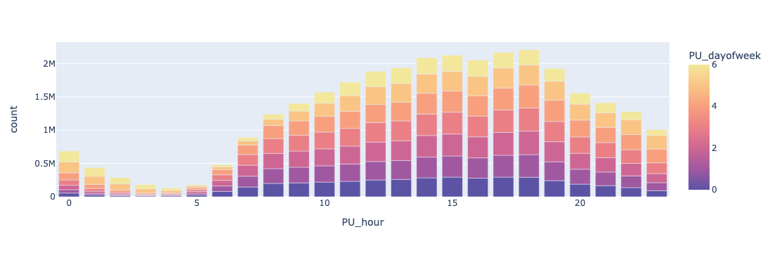
然后,我们可以使用像 Plotly 这样的库来可视化时间序列数据。下面的图表显示了每小时的乘车数量。从图表中可以看出,人们更倾向于在下午出行。此外,在周末,人们通常倾向于晚归。
import plotly.express as px

b = px.bar(
    gb_time.to_pandas(),
    x='PU_hour',
    y='count',
    color='PU_dayofweek',
    color_continuous_scale='sunset_r',
)
b.show()
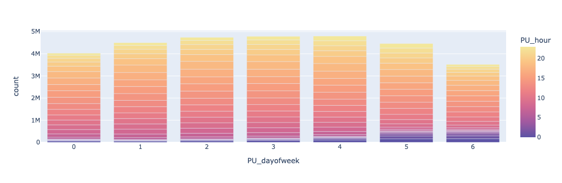
下面的图表显示了每个工作日的乘车数量。
b = px.bar(
    gb_time.to_pandas(),
    x='PU_dayofweek',
    y='count',
    color='PU_hour',
    color_continuous_scale='sunset_r',
)
b.show()
空间分析
分析纽约出租车数据集的另一个角度是查看旅途的空间分布模式。我们可以使用 groupby 方法按旅途起点区域 ID 和下车地点区域 ID 将数据分组,并计算每组的旅途数量:
gb_pu_location = trips.groupby(['PULocationID'], as_index=False).agg(count=('PULocationID', 'count'))
gb_pu_location = gb_pu_location.to_pandas()
gb_pu_location
| PULocationID | count | |
|---|---|---|
| 0 | 1 | 3006 |
| 1 | 2 | 13 |
| 2 | 3 | 1705 |
| 3 | 4 | 38057 |
| 4 | 5 | 115 |
| ... | ... | ... |
| 258 | 261 | 126511 |
| 259 | 262 | 446737 |
| 260 | 263 | 734649 |
| 261 | 264 | 229925 |
| 262 | 265 | 139525 |
263 rows × 2 columns
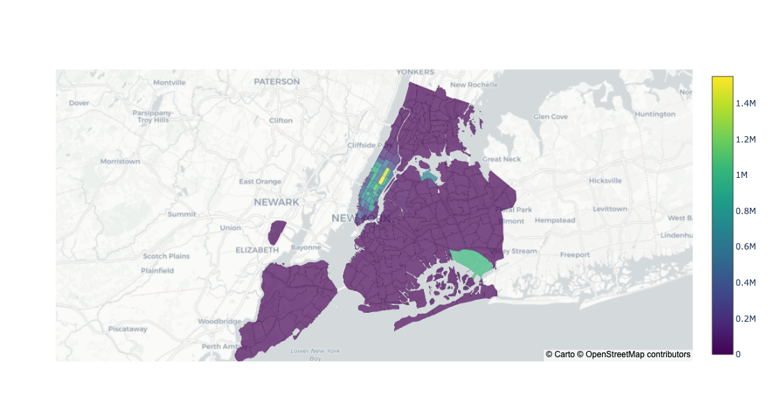
然后,我们可以可视化旅途起点的空间分布:
import plotly.graph_objects as go

fig = go.Figure(
    go.Choroplethmapbox(
        geojson=geojson,
        featureidkey='properties.location_id',
        locations=gb_pu_location['PULocationID'],
        z=gb_pu_location['count'],
        colorscale="Viridis",
        marker_opacity=0.7,
        marker_line_width=0.1
    )
)
fig.update_layout(
    mapbox_style="carto-positron",
    mapbox_zoom=9,
    mapbox_center = {"lat": 40.7158, "lon": -73.9805},
    height=600,
)
fig.show()
我们还可以按下车地点区域 ID 对数据进行分组:
gb_do_location = trips.groupby(['DOLocationID'], as_index=False).agg(count=('DOLocationID', 'count'))
gb_do_location = gb_do_location.to_pandas()
gb_do_location
| DOLocationID | count | |
|---|---|---|
| 0 | 1 | 55937 |
| 1 | 2 | 54 |
| 2 | 3 | 4158 |
| 3 | 4 | 134896 |
| 4 | 5 | 342 |
| ... | ... | ... |
| 256 | 261 | 116452 |
| 257 | 262 | 495512 |
| 258 | 263 | 698930 |
| 259 | 264 | 196514 |
| 260 | 265 | 92557 |
261 rows × 2 columns
然后,我们可以可视化下车地点的空间分布:

fig = go.Figure(
    go.Choroplethmapbox(
        geojson=geojson,
        featureidkey='properties.location_id',
        locations=gb_do_location['DOLocationID'],
        z=gb_do_location['count'],
        colorscale="Viridis",
        marker_opacity=0.7,
        marker_line_width=0.1
    )
)
fig.update_layout(
    mapbox_style="carto-positron",
    mapbox_zoom=9,
    mapbox_center = {"lat": 40.7158, "lon": -73.9805},
    height=600,
)
fig.show()
我们还可以探索的另一个领域是出租车区域之间的交通情况:
gb_pu_do_location = trips.groupby(['PULocationID', 'DOLocationID'], as_index=False).agg(count=('PULocationID', 'count'))

# Add zone names.
gb_pu_do_location = gb_pu_do_location.merge(taxi_zones, left_on='PULocationID', right_index=True)
gb_pu_do_location.rename(columns={'Zone': 'PUZone'}, inplace=True)
gb_pu_do_location = gb_pu_do_location.merge(taxi_zones, left_on='DOLocationID', right_index=True)
gb_pu_do_location.rename(columns={'Zone': 'DOZone'}, inplace=True)

gb_pu_do_location.sort_values(['count'], inplace=True, ascending=False)
gb_pu_do_location
| PULocationID | DOLocationID | count | PUZone | DOZone | |
|---|---|---|---|---|---|
| 44108 | 237 | 236 | 225931 | Upper East Side South | Upper East Side North |
| 43855 | 236 | 237 | 194655 | Upper East Side North | Upper East Side South |
| 44109 | 237 | 237 | 152438 | Upper East Side South | Upper East Side South |
| 43854 | 236 | 236 | 149797 | Upper East Side North | Upper East Side North |
| 49493 | 264 | 264 | 112711 | NV | NV |
| ... | ... | ... | ... | ... | ... |
| 1014 | 10 | 29 | 1 | Baisley Park | Brighton Beach |
| 21361 | 121 | 174 | 1 | Hillcrest/Pomonok | Norwood |
| 21909 | 124 | 174 | 1 | Howard Beach | Norwood |
| 868 | 9 | 29 | 1 | Auburndale | Brighton Beach |
| 49337 | 264 | 105 | 1 | NV | Governor's Island/Ellis Island/Liberty Island |
49751 rows × 5 columns
总结
总之,正如我们在本文中使用纽约市出租车数据集所展示的,Xorbits 是一种极其强大的用于探索和分析大型数据集的工具。 通过按照本文中所述的步骤,您可以更好地了解 Xorbits 的功能、易用性,以及如何将其与其他 Python 库集成,以简化您的数据分析工作流程。